
One of the most common sample packs you’ll see for Power BI is the Opportunity Analysis Dashboard. It’s a great illustration of the power of a good business intelligence and charting product; indeed, PowerBI is an incredibly powerful tool - but comes at a cost - both in terms of cash and time.
In this post, we’re going to use the 365Automate Charts solution to build out our own Opportunity Analysis dashboard in a SharePoint page and we’ll see just how quick and easy it can be to build out this kind of functionality yourself, and just as importantly, be able to modify it later.
Note: the prerequisite is that you’ve got a SharePoint list containing your sales/opportunities data, with columns like Region, Revenue, Partner Driven (yes/no), Sales Stage, and Opportunity Size. However, any columns or variation will work.
Firstly, you’ll need to install the 365Automate charting package. Check out the documentation if you need help getting started.
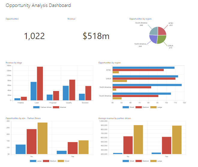
Here’s the intended outcome:
Edit your SharePoint modern page, we’ll get to work.
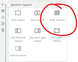
The page layout we’ve gone for here consists of two sections. The first is split into 3 columns, and the second section is 2 columns. Starting with a blank page, add the first section, and select Three columns:
Let’s fill in the three boxes.
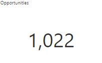
In the first section, we want to see a simple count of our available Opportunities:
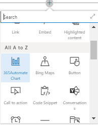
Firstly, add a 365Automate Chart web part to your page
Edit the web part and select the following options:
The configuration will look as follows:
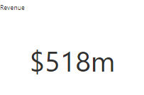
The second chart is the total Revenue. This is a SUM aggregation of all of the Revenue values in the list.
Repeat the earlier steps to add a 365Automate Chart webpart to your page. Edit it, and set the following options:
If you want to customise this further, you can add a filter to only show revenue of, for example, active opportunities.
Now we’re getting to the pretty charts:
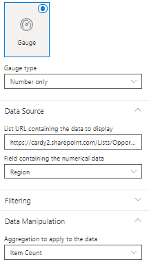
Settings for this chart are as follows:
How easy is that?
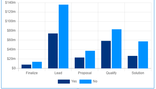
Now we’re on to the second row of charts. This first chart is a bit more interesting since it displays a real aggregation and two separate series:
Settings for this chart are as follows:
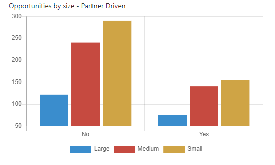
Charts 5, 6 and 7 are essentially variations of the previous chart - pick a field to display, and another field to group by. This one displays partner driven opportunities vs non-partner drive, and then further breaks them down by size:
Settings for this chart are as follows:
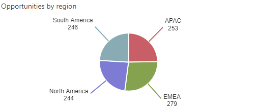
Here we’ll show the opportunities for each region, grouped by their size:

Settings for this chart are as follows:
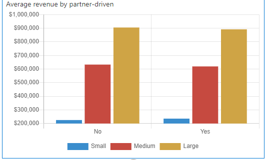
This chart focuses on the performance of partners vs the internal sales opportunities:
Settings for this chart are as follows:
In the above guide, we’ve seen how simple it is to build your own dashboards based on SharePoint List data. There’s no need to subscribe to expensive do-it-all solutions when your data is based on a SharePoint List; indeed, a simpler solution empowers colleages to modify and add to the dashboards in the future - the maintainability is in the hands of business users rather than developers and analyists.
Let us know what you’ve built.