
When you load your dashboard, there’s an incredible amount of data being displayed and numbers crunched behind the scenes such as aggregations. Indeed, in an organisation with hundreds of active users, constant refreshing of this data has the potential to cause slowness in your server and negatively impact the SharePoint health score.
In solutions like PowerBI, data ingress is done at fixed intervals - data is pulled from your SharePoint tenancy into the PowerBI up to 8 times per day, or more if you’re on the Premium tier. On top of that, visualization tiles are also cached which can add an additional delay. Of course, this is all done for good reason - avoiding causing an unnecessary impact on your SharePoint server, whilst also offering great performance.
The 365Automate Charts solution has an advantage - since its only data source is SharePoint, and doesn’t offer the option to join datasets like PowerBI does, it can take a more nuanced approach to performance and caching. The outcome is that you get the same great level of performance, but fresh data is the norm.
Let’s take a look at the caching and performance options.
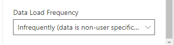
When you scroll down to the bottom of the properties pane, you’ll see this drop-down:
It contains 5 options:
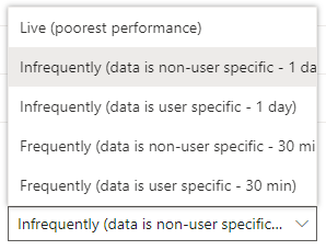
As you might have guessed, this displays Live data. Usually, performance is pretty good and the chart will load with less than a second. However, occasionally the response time can be as much as a few seconds in complex “drill down” charts and this is a little frustrating if you’re in a rush. Also, if you are one of many colleagues using the charts, you can quickly put pressure on your SharePoint server. So this option is only recommended when all of the following are true:
This is the most highly performant option. All data is cached at the tenant level for a whole day. Use this if you want to see a charts where the following are all true:
This is the option you should use if your list contains item-level security and you want all users to see only their data. Data is cached for a whole day, so you’ll get a daily refresh.
Using this option, the same data is displayed for all users, but refreshed every 30 minutes. You can use this option in organisations that have a large number of active users, but you want to see relatively up-to-date data. Only use this option where you’re happy for everyone to see the same charts.
This final option covers the last case. Use this option only where each user needs to see a unique chart reflecting their own data. It’ll be refreshed every 30 minutes.
As you can see, the data caching and performance options in 365Automate Charts are flexible to cover every scenario so that you can find a balance between performance, scalability in a large organisation, and data freshness.