
PowerBI is the default go-to product for dashboards, but is it always the best choice? In this post I’ll analyze PowerBI vs our very own charting solution.
Let’s review the minimal steps to get started with PowerBI in SharePoint:
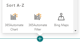
And the steps to achieve the same result with the 365Automate solution….
Winner: 365Automate
PowerBI allows combining the data with multiple lists and different data sources including Excel, SQL Server, and any number of third party services and apps. Also, it allows scripting with the R and Python programming languages, and of course, DAX. You can create joins to connect multiple sources together. The charts support drill-through and filtering options.
365Automate is much simpler. It supports one data source; SharePoint Lists. There’s also a filtering web part for filtering on any of the fields. That simplicity brings an incredible ease of use, but all of your data must reside in SharePoint.
Winner: PowerBI
Maintenance of a PowerBI report can get complicated because the person who configured it initially has a deep understanding of the configuration and data sources. Additionally, the report or dashboard has to be explicitly shared with other to be able to make modifications.

With the 365Automate solution, permissions are managed via the SharePoint page, so those users who have access to edit/publish the page will be able to modify the dashboard. It’s a lot simpler. You won’t need any prior knowledge of the individual charts to make modifications, since they have an easy wizard-style configuration interface.
Just use the SharePoint permissions model you’re already familiar with.
Winner: 365Automate
PowerBI currently costs $9.99 per user, per month (unless you’re an E5 customer). Shockingly, a license is required for all users, whether they’re the author or just a viewer. This cost can become prohibitively expensive very quickly.
365Automate charts have a fixed price model. That means you can give everyone access and it won’t break the bank.
Winner: 365Automate
With PowerBI, the data in your list is copied to their querying platform and the maximum size of your dataset is 1GB, which can comprise any number of rows in your list. This will permit the largest of SharePoint Lists - up to 30 million rows.
With 365Automate, the data never leaves your SharePoint tenancy and therefore the querying is subject to SharePoint limits. This means that each of the data points shown on graphs will usually need to be calculated from a maximum of 5000 rows in your list. You’ll need to apply a View to pull out the right subset of data if you have a large list. Normally, this isn’t an issue, but it’s something to be aware of.
Winner: PowerBI
With the 365Automate solution, your data never leaves your SharePoint tenancy and no data is copied or moved. With PowerBI, your SharePoint List data is copied across to the Microsoft Azure PowerBI service. From there, it is queried and used to build your reports. This allows it to be combined with data from other sources such as Excel.
An additional interesting point is that with PowerBI reports, all users see the same data and SharePoint ACLs are not taken into account.
Winner: 365Automate
PowerBI allows a maximum of 8 data refreshes per 24 hour period. 365Automate chart data is live - refresh the page to see the latest data. To improve performance, and for large deployments, you can optionally enable caching to reduce data refreshes. It’s in your hands.
Winner: 365Automate
PowerBI is a complex and powerful tool, and reports do take a couple of seconds to load.
This is an actual recording of a PowerBI chart, and the same 365Automate chart, side by side on a SharePoint page:
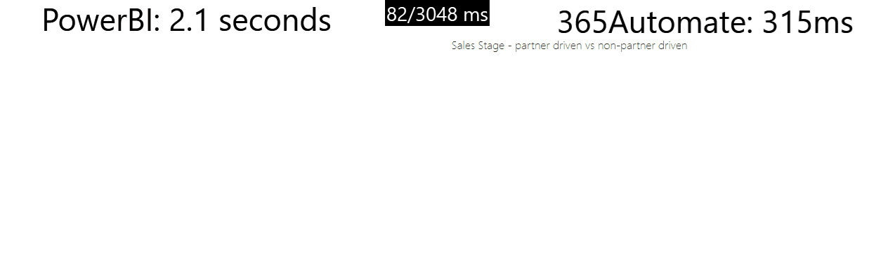
They’re both relatively fast - but 365Automate charts are around 7 times faster to load.
Winner: 365Automate
I’ve tried to be as objective as possible, so answering the question “which is better?” is tricky. However - we can be sure that if your data is fully SharePoint List based, then you should absolutely give the charts and dashboards solution a try. There’s a 30 day trial to allow you to evaluate for free.